Colors of the Kiln: How Glaze Tells a Story
Some cups speak softly, not through shape or texture, but through color. Not the flat kind of color you find on factory pieces—but color that moves. That shifts. That catches the light in ways you didn’t expect.

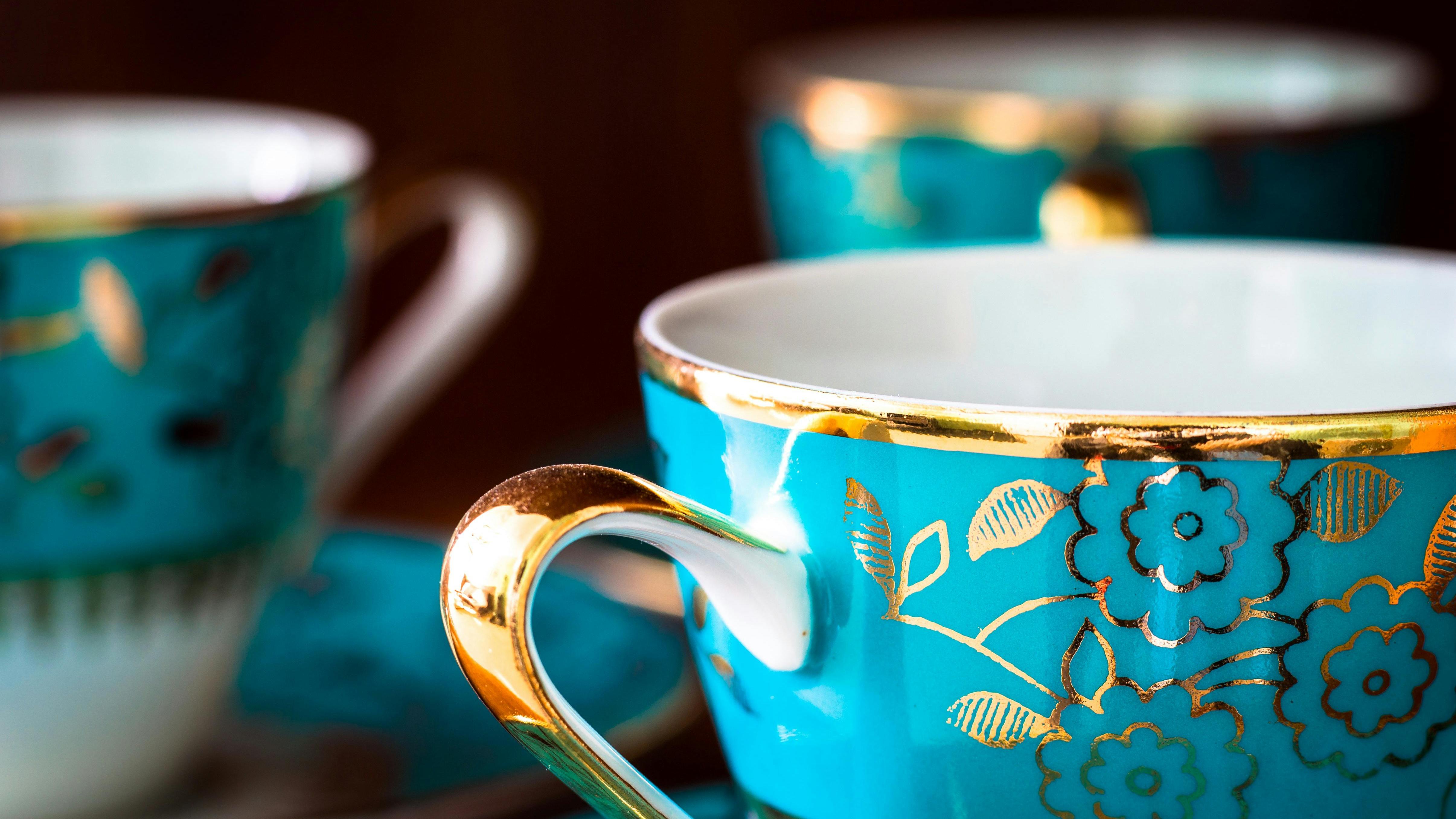
What I love most about glaze is that it’s alive. It reacts to heat, to minerals, to time in the kiln. It can’t always be controlled. You might expect blue and end up with foggy green. Or hope for cream and find a blush of pink blooming on the rim. That unpredictability is part of the magic.
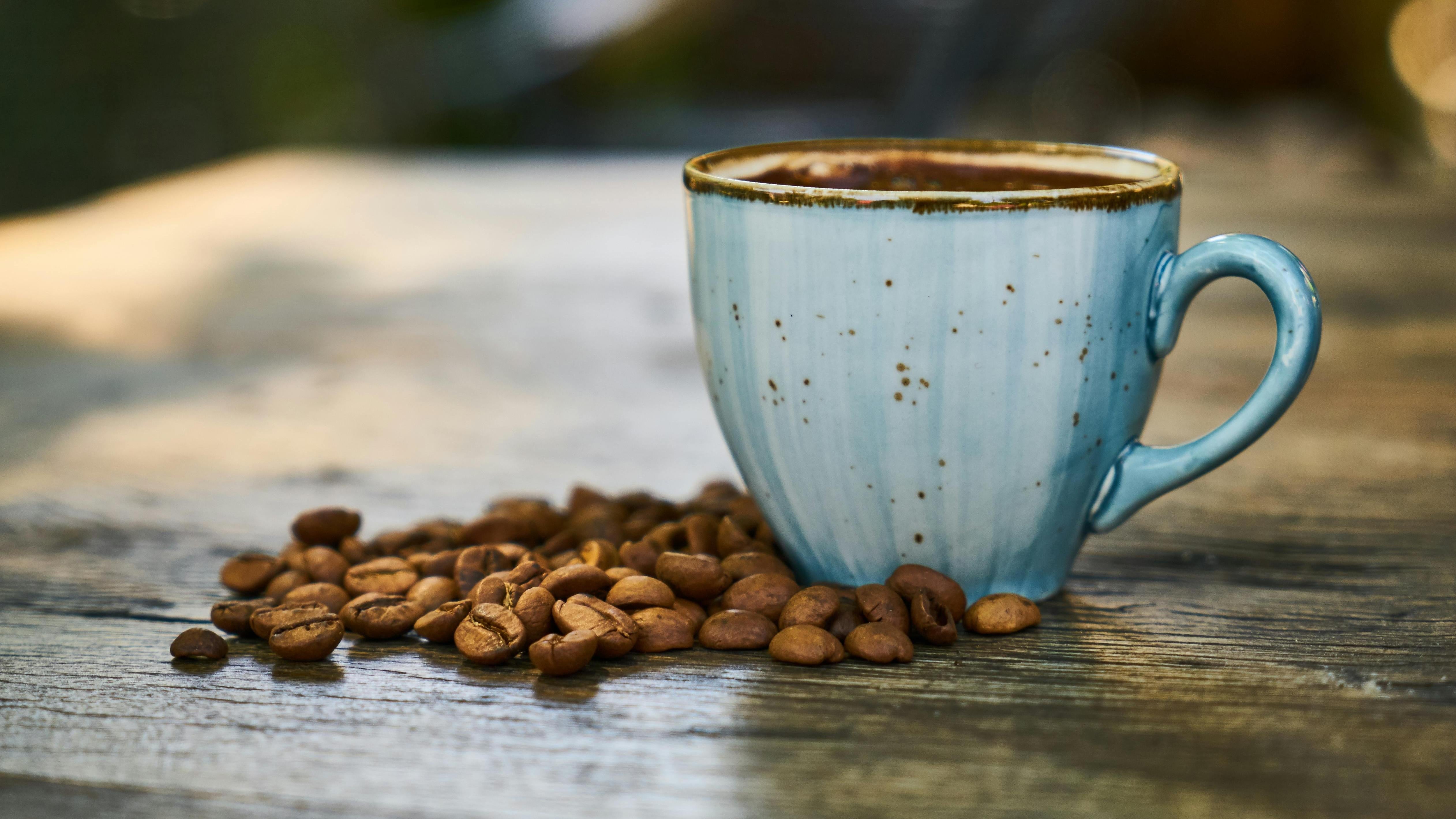
There’s one cup I own with a glaze that looks like dusk. It fades from soft ivory to a kind of stormy grey-blue, with little speckles where the heat kissed it too long. No two glazes ever turn out the same—even from the same potter, even in the same kiln. It’s nature, chemistry, and chance, all dancing together.

Sometimes people ask why I prefer these kinds of cups. The answer is simple: because they surprise me. Because I can see the fire in them. I can feel the decisions the maker made—where they dipped, how long they waited, how much trust they had to let the process finish without interfering.
And when I hold those pieces, I don’t just see color. I see story.
Glaze is memory. It remembers the hands that shaped it and the fire that revealed it. And if you slow down and look closely, it will show you something new each time.
Perfectly Imperfect: What a Handmade Cup Can Teach Us
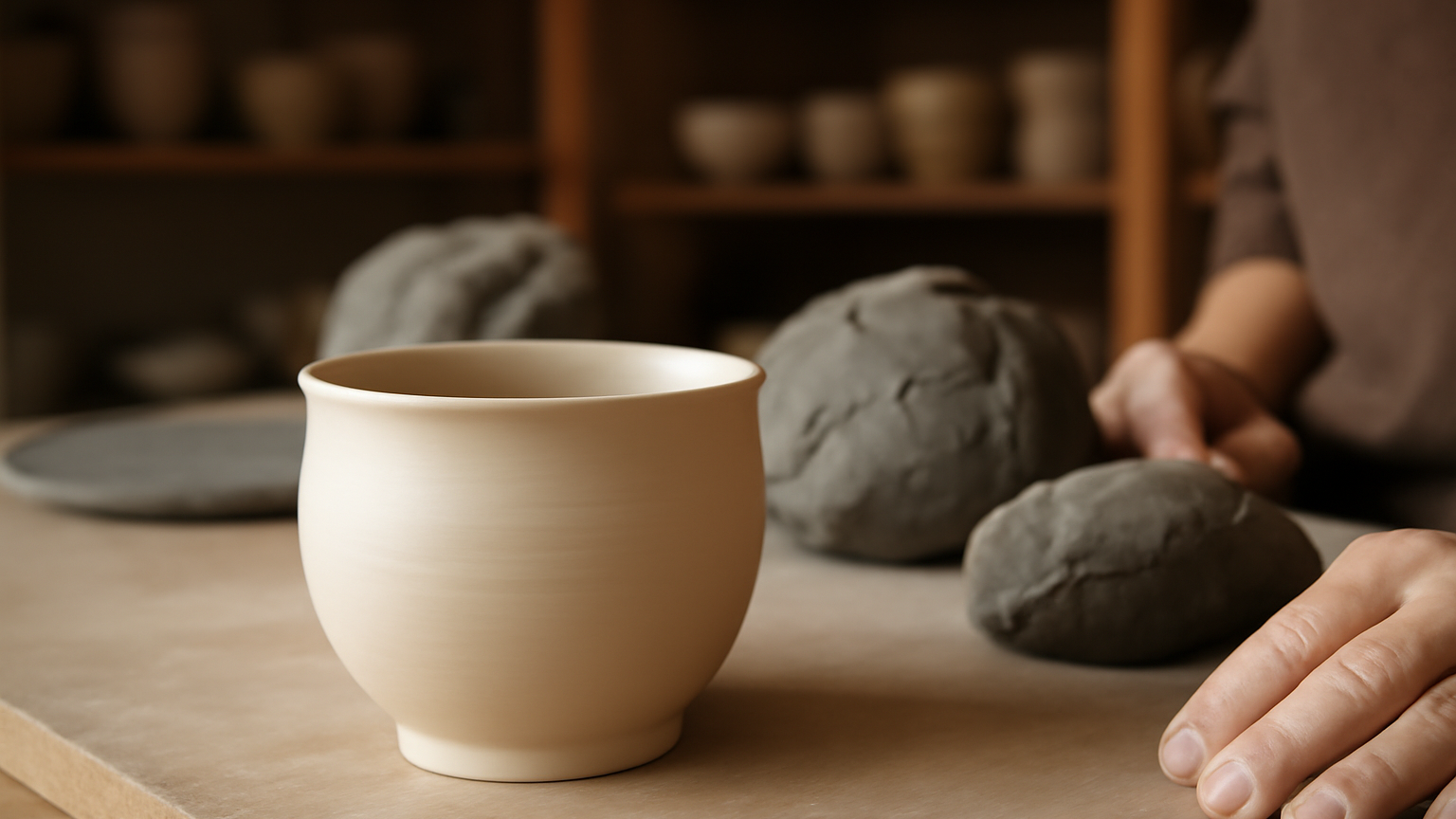
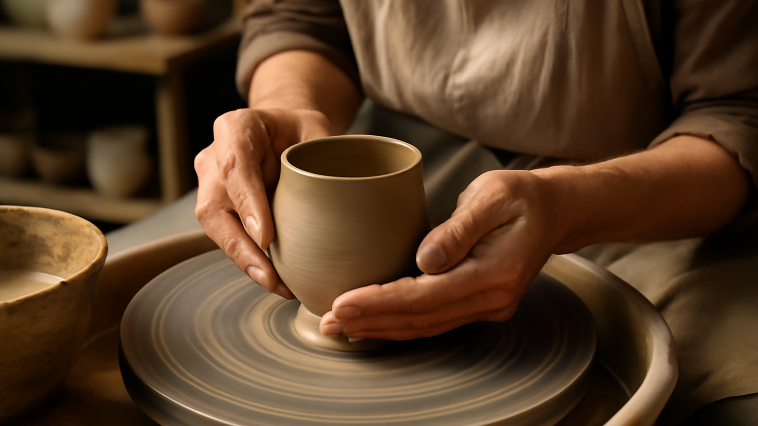
From Clay to Cup: The Journey of a Handmade Ceramic Piece
Articoli correlati
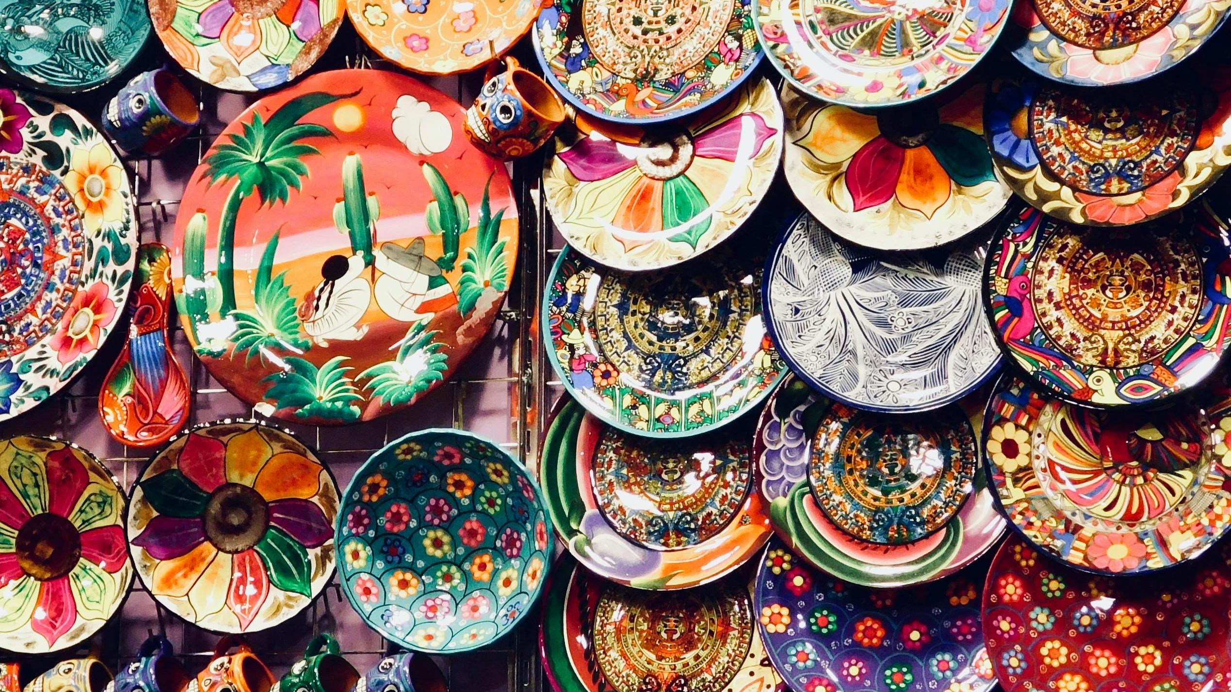
The Cultural Craft: How Ceramic Cups Carry Tradition and Innovation
Where Inspiration Lives: The Subtle Stories Behind Each Cup

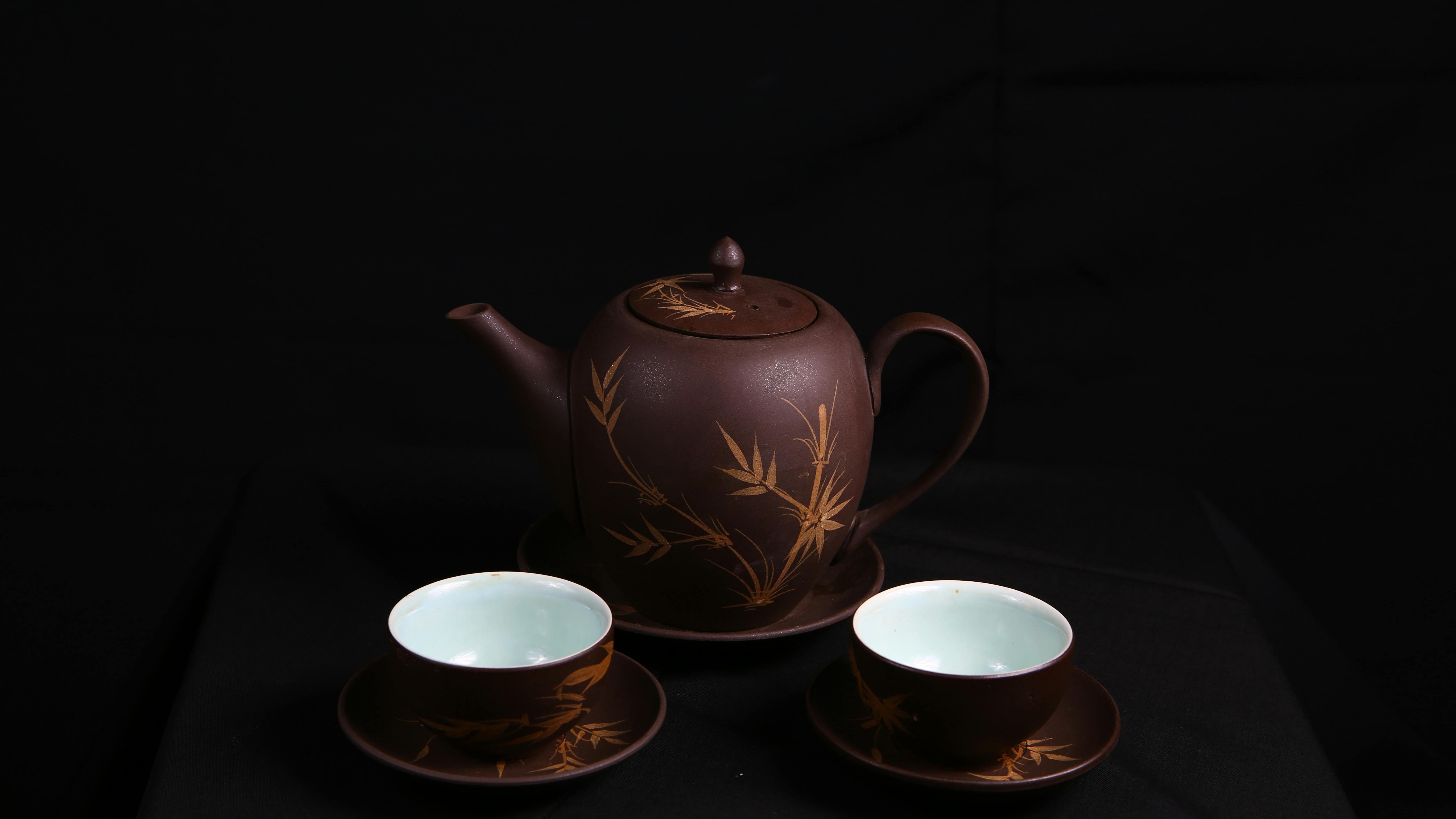
More Than a Cup: The Silent Companion in Your Everyday Life
The Heart of Handcraft: Why Every Ceramic Piece Tells a Story
The Quiet Strength of Ceramic: Why Handcrafted Pieces Last a Lifetime
The Art of Crafting a Ceramic Cup: Every Detail Matters